Whenever I use government websites, I felt like they are run by some secondary school kids.
Some time ago I was pissed that they support only IE browsers.
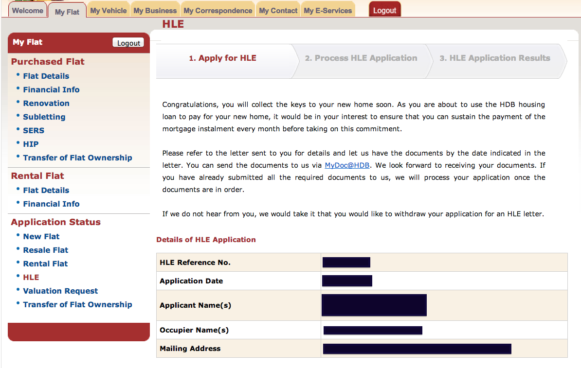
This time, while applying for HDB Loan Eligibility (HLE) on HDB website, I encountered a big usability issue.
Let’s take a look at what not to do when designing a website.
I logged into hdb.gov.sg, click on HLE, and the page shows my HLE application status. In the instructions, it says that I can send documents via MyDoc@HDB.
And so I clicked on that MyDoc@HDB link.
Oops.
It says:
HDB is processing your application. If you receive a HDB letter requesting for document(s), you can submit the documents electronically via this e-service MyDoc@HDB.
That’s all. Nothing else I can do.
Hmm..
At this point, most users will be confused. I was utterly confused. I know one guy in HWZ was confused.
I am thinking: I need to upload documents via MyDoc@HDB, but yet I can’t do anything on the page.. and seems like HDB is “processing my application”.. What are they processing? Do I have to wait?
I wasted a lot of precious time before figuring out.
I was not at MyDoc@HDB page.
To access MyDoc@HDB, you have to go to My E-Services (top navigation) > … > MyDoc@HDB.
WTH?!
Learning points:
- If you have a MyDoc@HDB link, then please link it correctly to MyDoc@HDB
- And don’t give confusing messages
Argh.

